A redesigned information architecture for Leopold’s website that helps customers easily find key information and place orders, enhancing in-store service and operations.

Duration
3 months | 2024
My Role
UX Designer and UX Researcher
Tools
Figma, Chat GPT4, Adobe Illustrator
Teams
SCAD Students
3 other UX Designers
My Role
I led a cross-functional team in the UX redesign of Leopold’s website, driving product research, coordinating card sorting sessions, guiding responsive prototyping and user testing, and overseeing motion design to improve usability and support business objectives.
Problem
Leopold’s website suffers from a cluttered and inconsistent navigation system. With unclear categories and disorganized content, users often feel overwhelmed and struggle to find key information, leading to frustration and drop-off.
Despite offering pickup, poor visibility and a confusing product page—with unclear flavor info and UI issues—make ordering frustrating and limit opportunities to ease in-store wait times.
The redesign must preserve all existing information architecture elements, focusing on reorganizing them for better clarity and usability.
Solution Highlights
Reorganized the homepage to guide customers more easily through the site, while preserving Leopold’s original branding to maintain familiarity and trust.
Reduced unnecessary steps in the ordering process and improved navigation, making it easier for users to choose services and flavors—while highlighting seasonal options to create a more personal, engaging experience.
Before & After
The old homepage lacked visual focus, making it hard to know where to look. In contrast, the new layout establishes a clear path — from brand identity to featured products —helping users make faster, more confident decisions.

The simplified selection flow and clearer product details reduce user error and boost confidence. This improves conversion and creates a smoother experience across both online and in-store touchpoints.


Research Insights
By conducting interviews with customers near the Leopold’s storefront, we learned that most purchases happen are in-store. However, many customers rely on the digital menu on Google map and social media before or during their visit which informed online and offline touchpoints to shape the full Leopold’s experience.

Because of the unclear information architecture in the website, we conducted an open card sorting exercise with users. Participants were asked to group existing website content into categories that made the most sense to them.
This helped us understand users’ mental models and identify confusing or redundant labels.

Based on the card sorting results, we restructured the navigation to better reflect users’ mental models and task flows. The new IA emphasizes action-driven categories like Order Online and Menu, while still supporting brand storytelling through sections like About Us and Events.
To enhance clarity, we also revised key labels through UX writing, shown in red boxes in the diagram. These changes aimed to make navigation more intuitive and clearer.

Iteration Challenge
To validate our design decisions and further refine the user experience, we conducted A/B testing on both the homepage and the product page with 30 participants.
One key insight was the need for clear functional separation, where users expected more direct, actionable layouts.
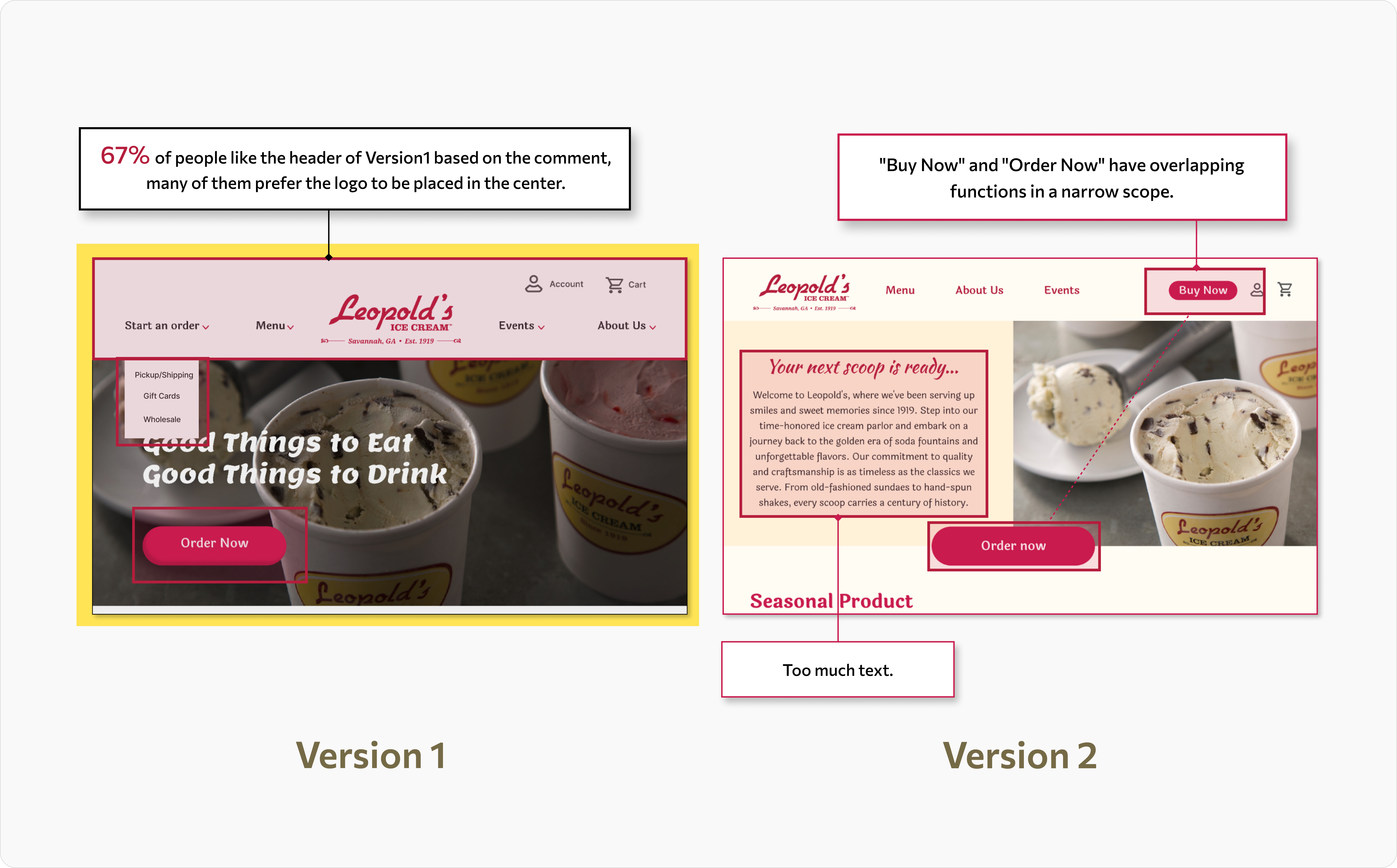


The A/B testing highlighted the importance of clear step-by-step customization, easier search access, and visually streamlined interactions to reduce cognitive load and enhance decision-making.


UX Writing
We found that UX Writing plays a critical role in simplifying decision-making on consumer-facing platforms. On the product customization page, we reorganized flavor selection using a step-by-step format and instructional words.
We also refined ingredient labels and icons to increase allergy awareness and dietary confidence, helping customers feel safe and informed throughout the ordering process.

Final Prototype